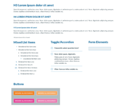
#00AEE0
#E44498
#F08022
#77bb44
Apply UX design process to overhaul primary website for nonprofit organization
Year
2017
Roles
Project Management
UX/UI Research
UX/UI Design
Data Analytics
Client
Ohio Education Association
Recognition
Award of Distinction, State Education Association Communicators
Overview
The Ohio Education Association (OEA) wanted its website to be an essential resource for educators, parents, and stakeholders across the state. However, anecdotal evidence suggested that users could not find anything on the site unless they already knew where to look. The site used OEA’s org chart as the basis for the site organization and menu structure, so anyone unfamiliar with OEA operations would naturally have difficulty navigating the site.
It did not help that nearly all new information was added to the homepage, making it appear cluttered and old-fashioned. Making any changes to the website was challenging using the custom content management system that the site was built with and the product was no longer being supported by the developer.
OEA wanted to redesign the website in conjunction with an update to OEA’s visual identity and brand guidelines. The organization’s brand personality and tone had evolved, but its visual identity had not. The objectives of the project were to 1) reorganize the site to be more useful for members; 2) develop the site on WordPress to make it easier to update and revise; and redesign the visual identity to reflect its current brand.
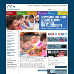
OEA website pre-redesign
Discovery
To begin, I led a multi-functional committee of OEA members and staff to study the OEA website and advise leadership on the optimal course of action to take regarding it. Our recommendations stressed the importance of following a process to ensure that decisions stay focused on user needs and based on user data, i.e., a UX design process.
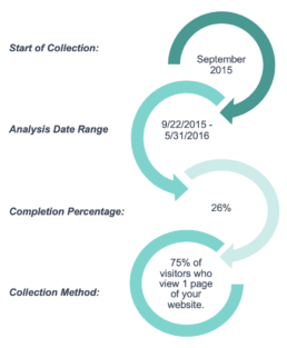
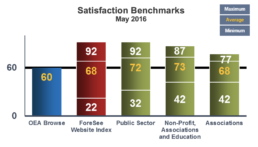
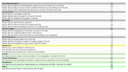
To assist OEA in collecting data on the experiences of visitors to the OEA website, I recommended contracting with ForeSee, a leader in customer experience analytics. We worked together to develop the popup survey randomly presented to visitors whose activity met the required threshold. The custom questions I wrote were designed to capture information specific to OEA members and site visitors so that we could establish profiles of the site visitors. To augment and humanize the anonymous survey data, I conducted one-on-one interviews with individual members.
ForeSee’s scientific methodology defined each group according to satisfaction with the site, perception of the site’s components, and predicted future behaviors. They built a model that quantified the value of a highly satisfied user by predicting how satisfaction would impact their likely future behaviors. Moreover, ForeSee identified which elements of a user’s online experience was driving satisfaction.
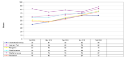
The model measured satisfaction along five key factors: information browsing, look and feel, navigation, site performance, and site organization. Difficulty finding information and navigating the site were the most important factors for users. Changes in these areas were also predicted to potentially have the strongest impact on user satisfaction.
Design
Data clearly indicated that the focus needed to be on improving the website’s navigation and organization. To understand how average website users organized the site, I worked with Cornershop Creative, specialists in nonprofit web development.
It was difficult to determine relationships between title concepts because there are many pages across a wide set of topics.
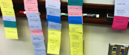
Cornershop Creative ran a card sorting study using an online tool called OptimalSort. The results didn’t provide much direction. Only 39% completed the study, a low participant rate, and of those there was little agreement in how the cards should be ordered.
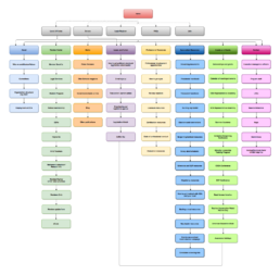
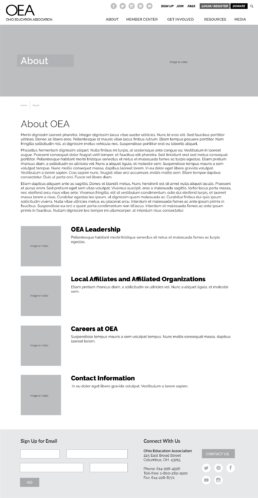
We ran a Tree Test using a sitemap I proposed that incorporated the results of the Card Sorting Study, interviews with individual users, and knowledge of visual psychology and basic design principals. The results of the Tree Test were helpful, providing more definitive indications as to how users interacted with the new site structure.
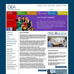
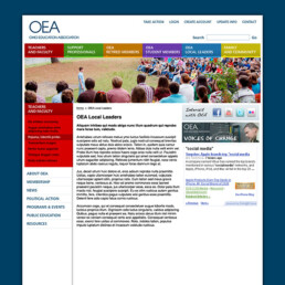
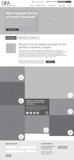
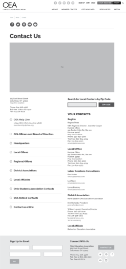
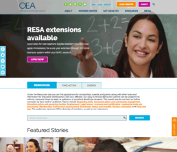
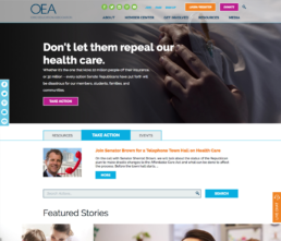
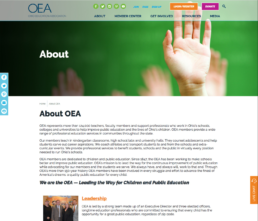
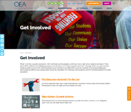
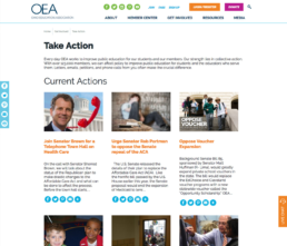
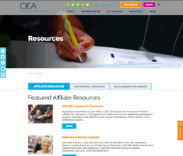
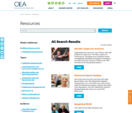
To guide visitors through the site, I prioritized white space with brightly colored accents to identify signposts. OEA’s visual identity had been dark and authoritative, representing the role OEA had been limited to until recently. The redesign reflects its new brand: optimistic, energetic, and excited to effect change. The old cluttered homepage was reimagined as a gallery of large images and sparse text, transforming it into a powerful tool for featuring important news and links.
Outcome
- 33% Increase in overall user satisfaction
- 62% perceived improvement in information browsing
- 25% perceived improvement in navigation
- 17% perceived improvement in site information
- 17% perceived improvement in look and feel
- Satisfied users are more likely to return to the site, to join, to donate, and to advocate for OEA.
The new site is intuitive, streamlined, and easier to navigate. Website metrics improved across the board. Traffic increased for both new and returning visitors and the bounce rate decreased dramatically.

